Inware 7
Designing a clearer way to explore everything Android can tell you about a device.
RoleDesign and development
StackMaterial 3 / Kotlin / Jetpack Compose / Navigation 3
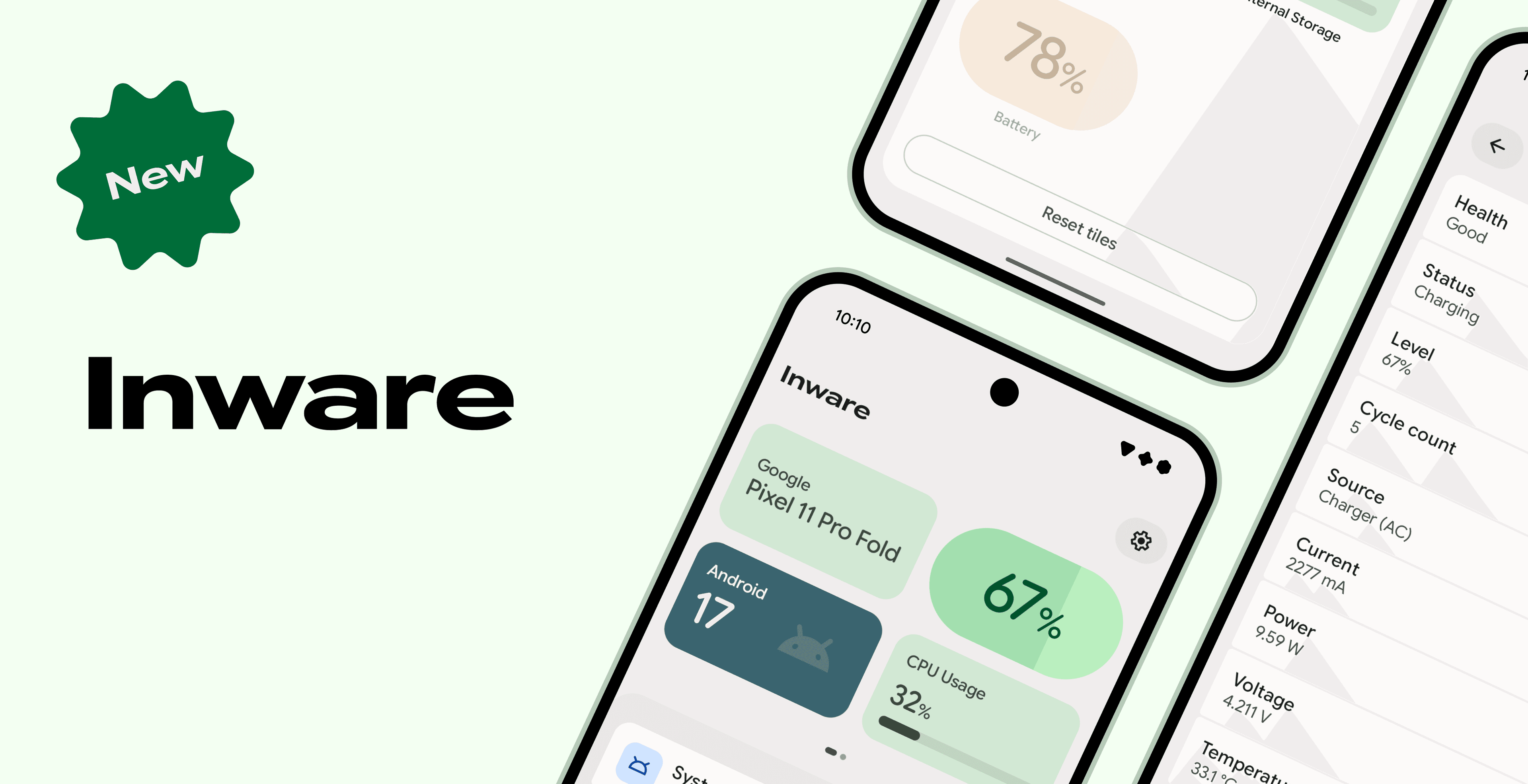
Inware 7 is a complete overhaul of my Android device information app. It shipped in April 2026 and has kept moving since. It's the completion of the Jetpack Compose transition, and a complete Material 3 Expressive redesign. I had no specific design in mind, only certain constraints. Every decision was implemented and tested live on a device so the motion could be judged for real, whether by me or by testers. That is how I made sure Inware felt right.
Jetpack Compose
I started fiddling with Jetpack Compose in 2019, and tracked its progress ever since. In 2020, before Compose was even stable, I published compose-to-edge, a small library for going edge-to-edge in Compose apps. In 2022, I started implementing Compose in Inware: I knew Google was betting on it. It was showing up in Android itself, in Settings and SystemUI, and Google had built Now in Android, a reference app written with it. So while Android Views were still used at the time, Compose was a modern toolkit that was actively being used and developed. By the last 6.x release, various components of Inware were already Compose, but it was still a hybrid app.
Inware 7 is the first version fully written in Compose, a decision Google confirmed earlier in 2026, when Android UI officially went Compose first.
From 6 to 7
For years, Inware relied on Overpass Mono as its brand font. The font, along with the cards of the home screen, made Inware easy to recognize up to version 6. With Inware 7, things changed. While the brand color remains #33CC7A and dynamic colors are still supported, Google Sans Flex now replaces Overpass Mono. It is a variable font with many axes to tune, it is visually balanced, and it is the font Pixel devices use, so it feels at home on Android. Users who would rather not have it can switch to the system font in the settings. The cards are also gone. The refresh went all the way down to the app icon and the splash screen.
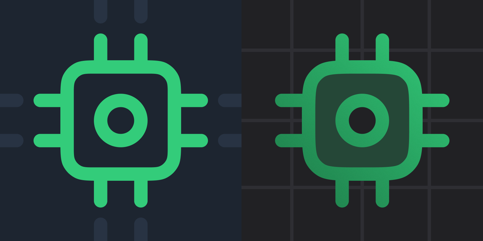
Inware is represented by a chip as its icon, and the new logo introduced with version 7 keeps it. The old logo was a good one, but it felt too generic, too simple. And as the app evolves, so should the logo. We're entering an era where modern logos use gradients: Android app icons are getting redesigned all over the place, and as Inware is built to fit Android, its logo should follow. The changes remain small: a grid as the background, smoothed corners, tweaked colors, etc. So Inware remains easy to identify, but feels modern.
Inware is made to embrace Android: it follows Material closely, and it should feel like it belongs on the device it describes. This is why dynamic colors are enabled by default. Like the system, the app can take the colors of the wallpaper. Dynamic colors are only as good as the device's implementation, though. On a Pixel, they behave the way Material intends. On Samsung's One UI, they are more of an adventure. Fixing that is on Samsung, not on apps, so Inware simply lets users turn dynamic colors off.
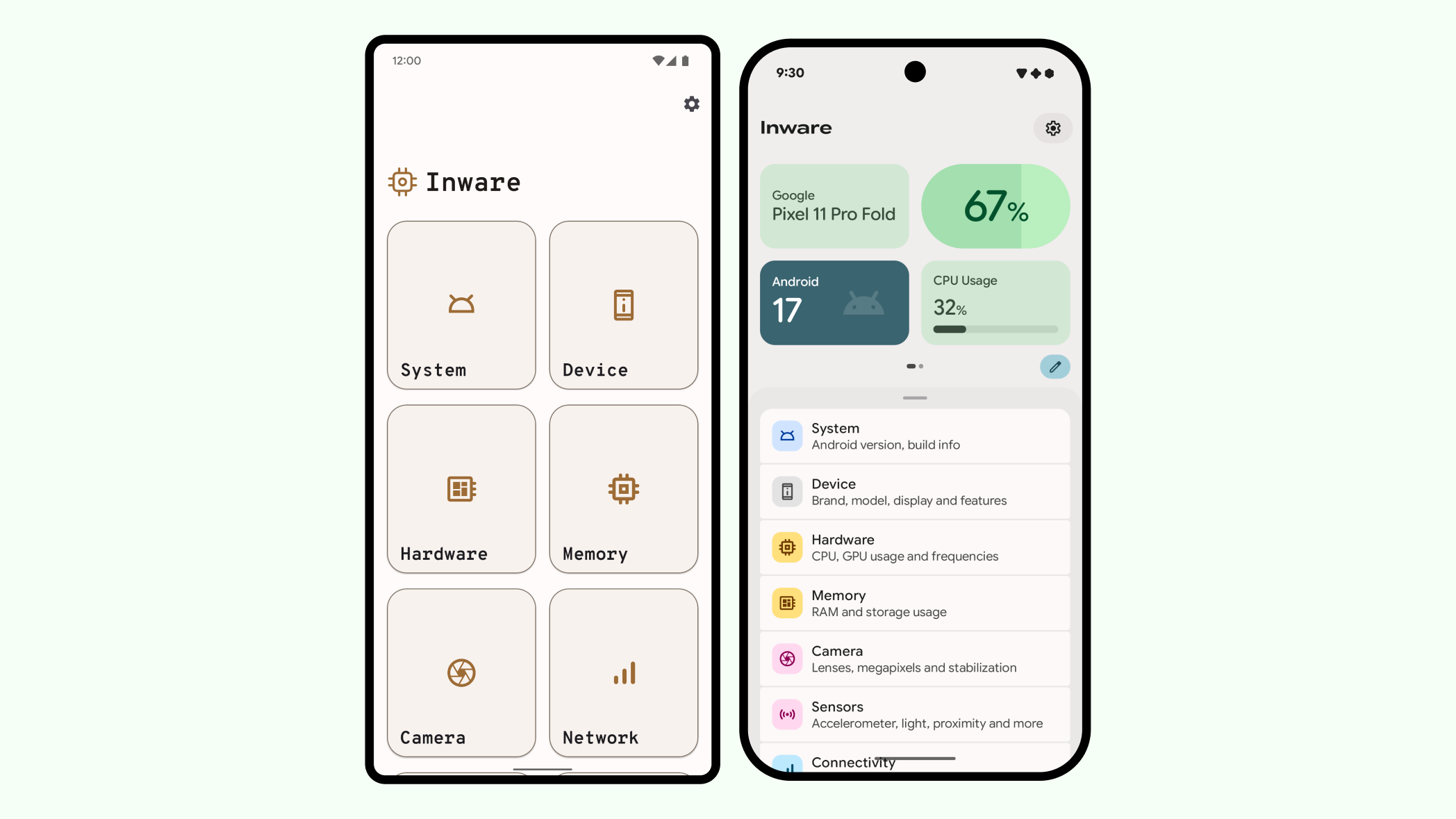
The home screen of Inware 6 was a grid of large cards, each showing an icon and a name. The cards did not describe the pages behind them, so the only way to know what a page contained was to open it.
In Inware 7, every destination is still there, but each one now has a description. And above the list, a dashboard shows a few live values, through tiles that users can pick and arrange themselves.
Navigation
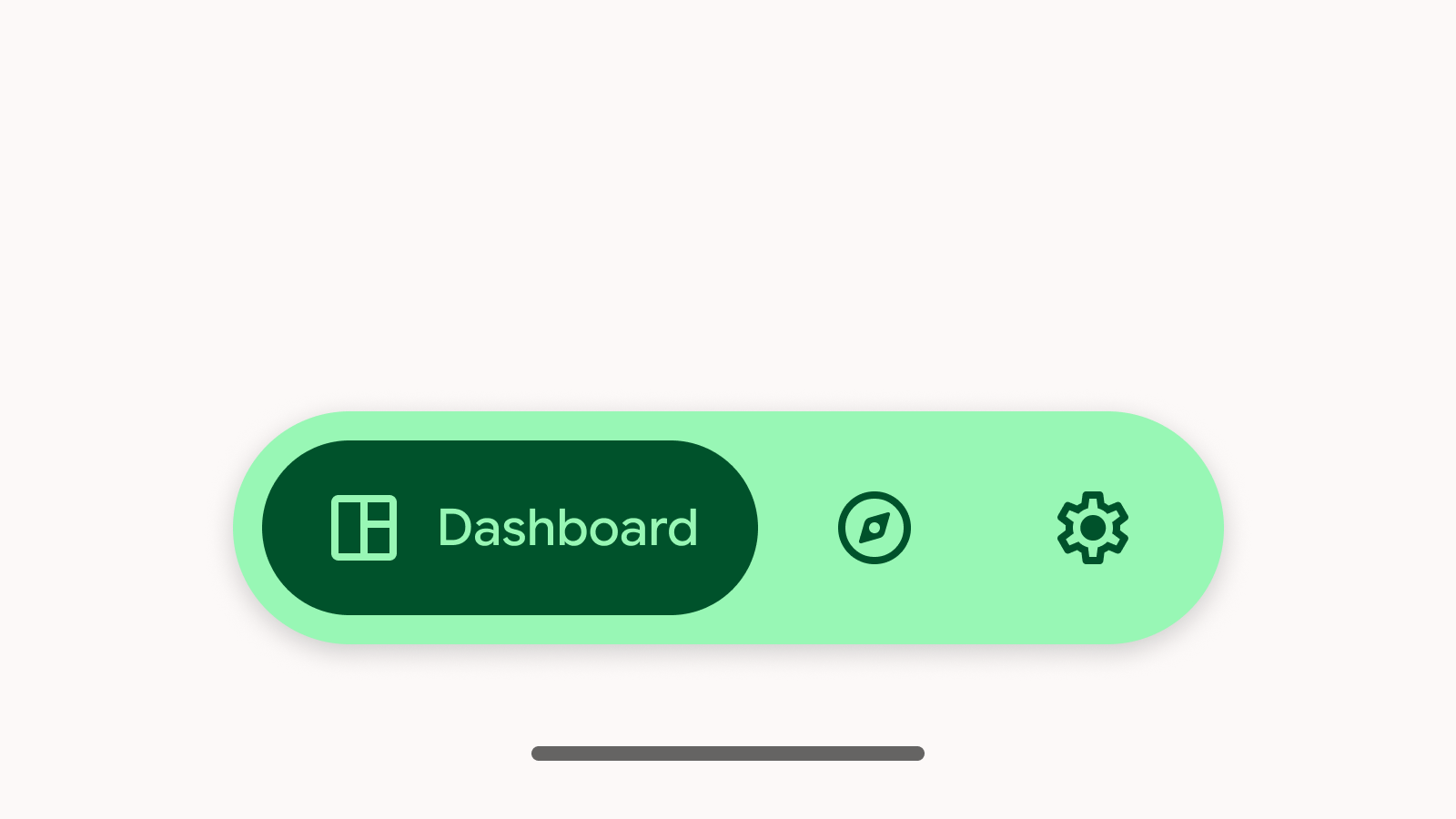
The home screen did not start out as a single screen. Initially, the dashboard, the explore page with the list of destinations, and the settings were three separate pages. The plan was to move between them with a Navigation Drawer, but I switched away from it before it was ever released: in a drawer, the dashboard would have been yet another page in a list, sitting somewhere between Device and Hardware. A floating toolbar at the bottom took its place. It worked well.
A dedicated dashboard page had room to preview a lot more tiles as soon as the app opened. But testers highlighted how it became harder for them to quickly jump to a specific data page.
One way to do that would have been to make the explore page the default, or to make the default page configurable. But in both cases, the dashboard page would have become less useful. Instead, I merged both pages into a single screen, and one of my favorite components made it possible: the Backdrop.
The dashboard became a back layer of live data, the destinations became a front layer that you can drag over it, and the settings moved into a button at the top. The Backdrop was released in beta, and people quickly preferred it to the toolbar.
Dashboard
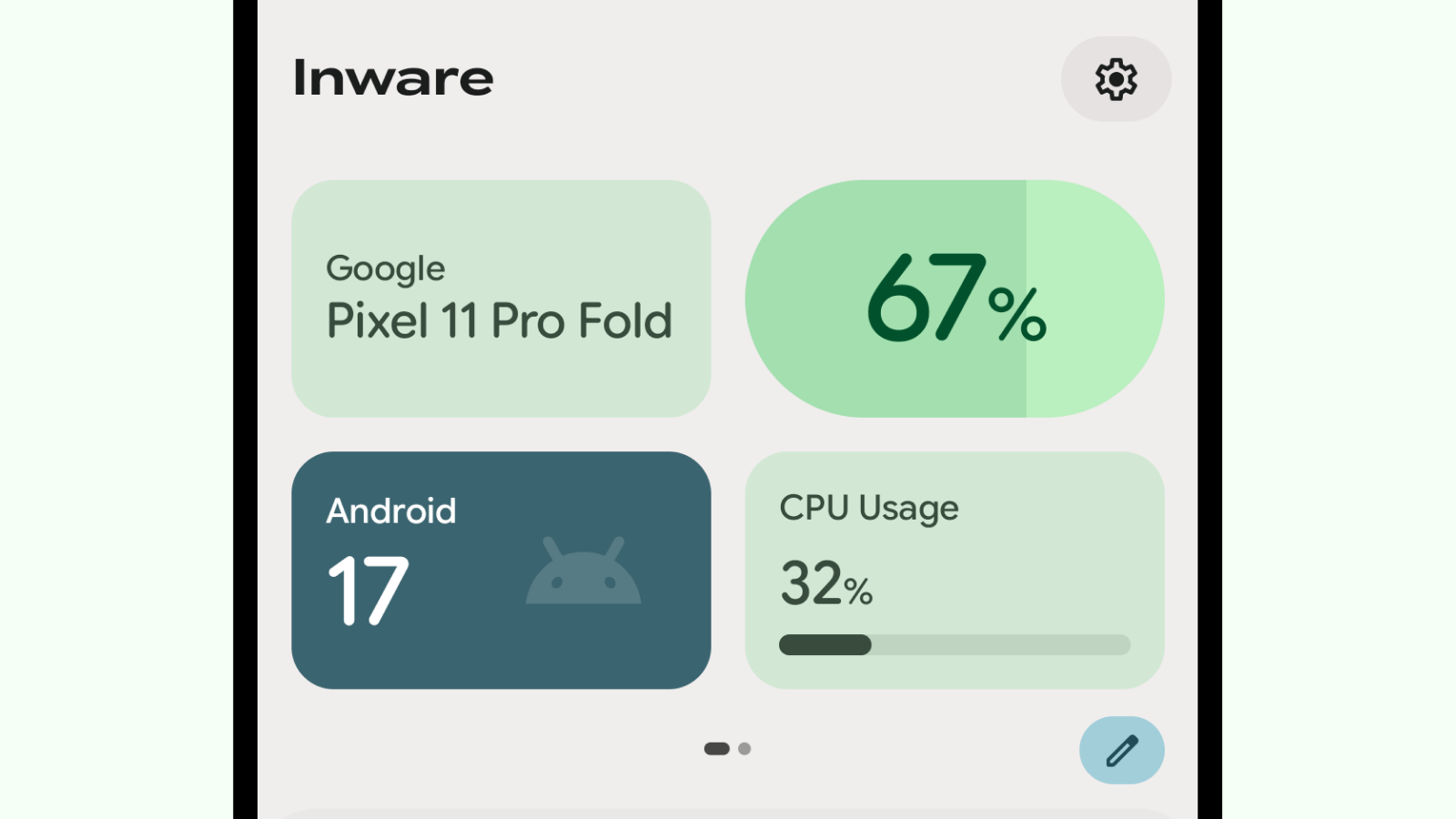
The dashboard is made of tiles. Each of its pages contains four of them. When four tiles are not enough, additional pages are just a swipe away. Every tile has the same size, which allows the grid to adapt to any screen without the tiles having to change. However, not everyone cares about the same data, which is why users can also customize their dashboard.
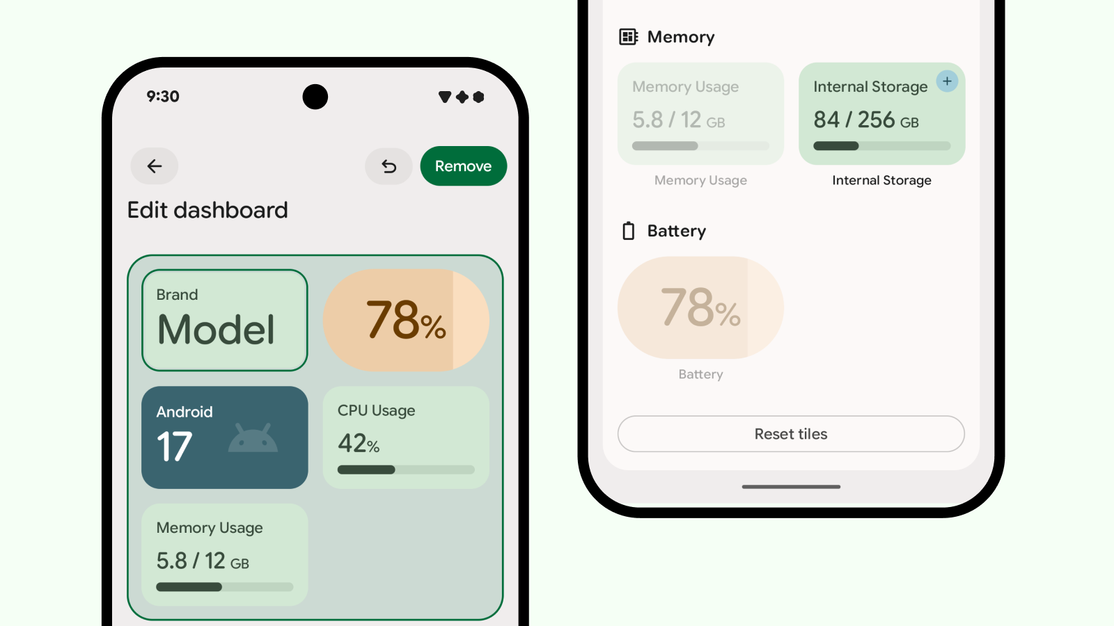
In edit mode, users can reorder tiles, add them, or remove them. Tiles that are not in use sit in a catalog below the grid, grouped by destination. You can't really break anything while editing. An undo button shows up after your first change and reverts changes one by one, and the reset button stays disabled until the dashboard no longer matches the default.
The editing system was also made to look like the editor of Android's own Quick Settings panel. Inware is built to stay close to how the system works, and this was a way to avoid asking users to learn a new system: they can edit their dashboard the same way they already edit their QS Tiles.
Inside a page
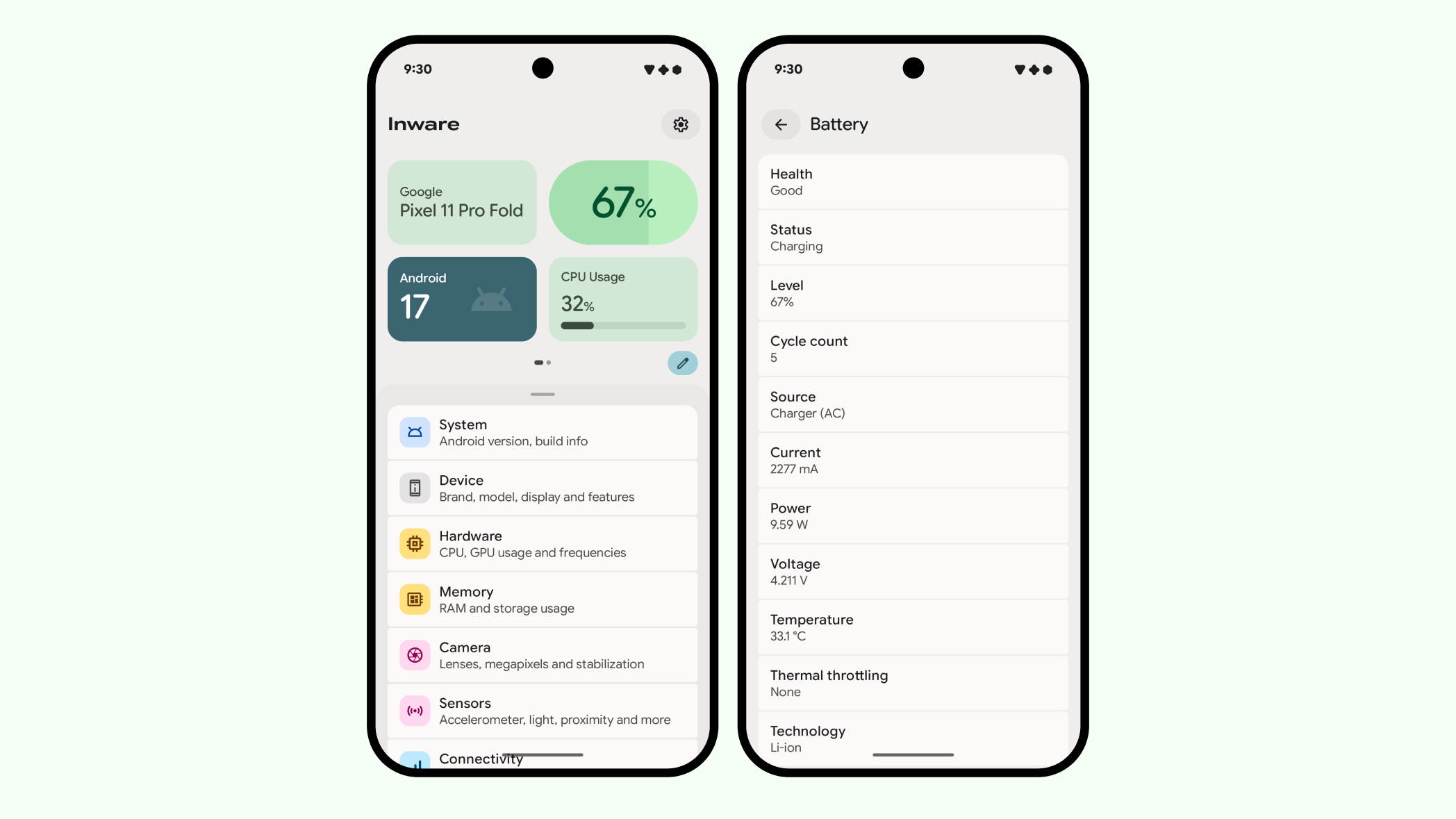
Each tile is both a preview and an entry point. The battery tile only shows the level. The page it opens has the rest: health, cycle count, charge current, temperature, and whatever else the device can report.
I also made every destination declare its parent. Back navigation and iw:// deep links both rely on that declaration, so a page opened from a link behaves exactly like a page opened by hand.
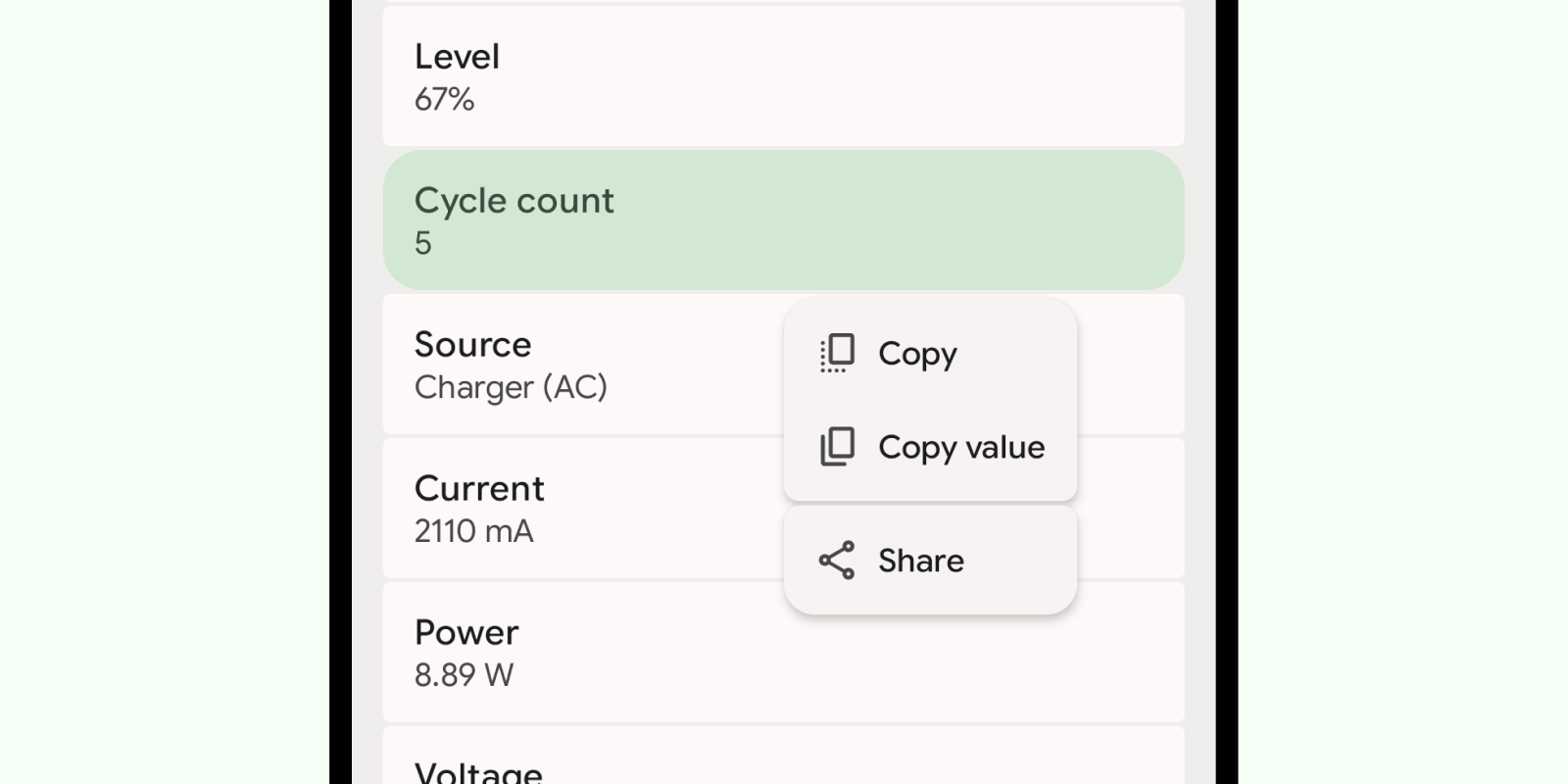
The values are the reason people open Inware, so I made them easy to take out of it. A long press on any value opens a small menu to copy or share it, without going through a screenshot. It may sound like a detail, but values like a kernel version or a build number are long, and nobody should have to retype them by hand.
Material 3 places menus relative to the component that opened them, and prefers extending to the right, which for a long press often puts the menu under the thumb of a right handed user. Inware handles the menu position differently. I believe a touch context menu should open away from the hand, so Inware uses a custom position provider that opens the menu on the opposite side of the press. You usually press on the side your thumb rests on, so a long press on the right side of the app opens the menu toward the left, and a long press on the left opens it toward the right. I shared that view with the Material team.
Bottom sheets
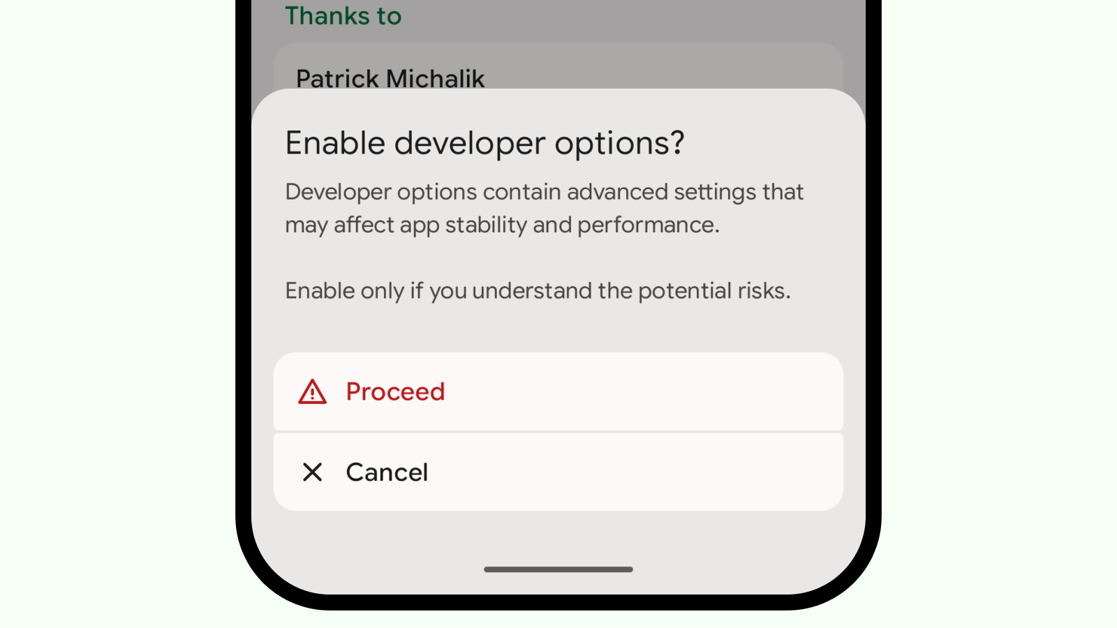
A confirmation like this is usually a dialog: a card in the middle of the screen, two small buttons in a row. On a tall phone, that puts the decision away from the thumb, and it leaves little room for the warning itself.
Inware uses a bottom sheet instead, which is what the Material 3 guidelines suggest: on mobile, a modal bottom sheet is recommended as an alternative to simple dialogs and inline menus, especially when actions need icons or longer descriptions. The page stays visible behind a scrim, the sheet sits where the hand already is, and Proceed and Cancel are full-width rows rather than dialog buttons. This one cannot be dismissed by tapping outside or by going back, and since it cannot be swiped away either, it does not show a drag handle. Enabling developer options is a real choice, so the sheet waits for one.
The same sheet is used for confirmations and for lists of actions, so a warning does not look like a different kind of UI from the rest of the app.
Big screens (in beta)
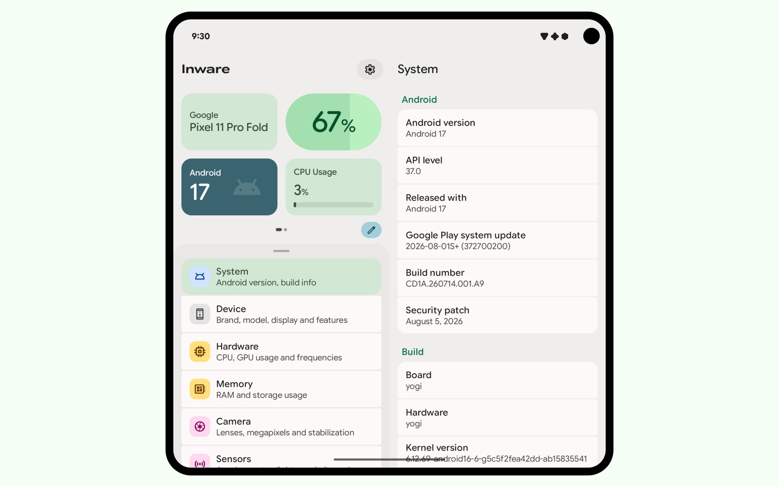
On large screens, Inware uses a list detail layout: the destinations stay on the left, and the selected page opens next to them. The list could not simply transform into a Navigation Drawer or a Navigation Rail, because the selected page would then be alone on the screen, either quite large or centered with empty space around it, and the dashboard would have had nowhere to sit. Material 3 provides a scaffold for this layout, and while it animates the transition between the list and a page, it does not animate the move from one page to the next, which in Inware is most of the movement. So I wrapped the Material 3 scaffold into my own and added the missing transition. It ships in 7.1.0.
Inware 7 did not stop at 7.0. It is still built the same way: every change is tested live on a device, then sent to the testers. The Backdrop came out of that, so did the dashboard and its editor, and so will the list detail layout. That's Inware for you.