Material 3 Adaptive: Making Responsive Layouts with Jetpack Compose easily
A glimpse at Google’s next Material 3 library.
August 28, 2023
Over the past few months, the Material team has been working on a new Jetpack Compose library: “Material 3 Adaptive.” It will allow you to create responsive layouts in a much easier way than is currently possible. While this new library is not yet formally released, I couldn't resist giving it a try and taking this opportunity to give you an early glimpse at it.
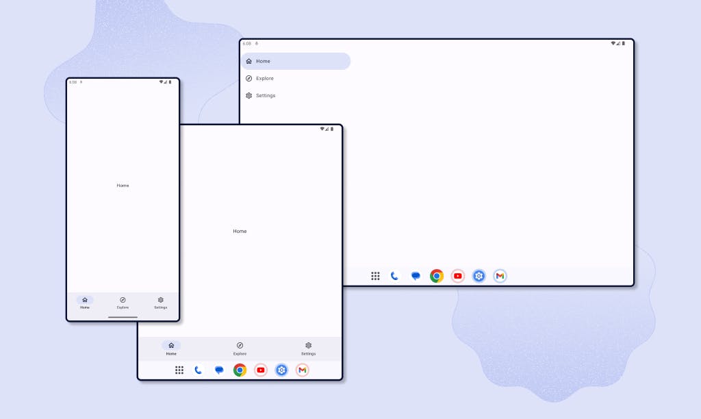
Currently, Google's recommended way to support different screen sizes when using Jetpack Compose is to use the Material 3 Window Size Class library. The library allows you to automatically classify the width and height of the current screen into one of three classes: Compact, Medium, and Expanded. Based on the width and height classes, you can then choose which navigation component to use. Google’s “Now In Android” sample uses the Window Size Class library to determine if the app should display a Navigation Bar. It only displays it when the widthSizeClass is equal to Compact. Otherwise, it uses a Navigation Rail.
This solution works well, but you may also want to display a Navigation Bar when a foldable is in tabletop mode. In this case, you would also need to use the Jetpack WindowManager library or the Accompanist Adaptive library, which simplifies the process of using the WindowManager library by providing a calculateDisplayFeatures composable which returns a list of DisplayFeatures.
The point is, there's currently no easy way to support different screen sizes. But what if there was a single composable that lets you define how to handle different screen sizes and device postures? Meet the Material 3 Adaptive library.
Note
The Material 3 Adaptive library is still in development and is not yet released. The API is subject to change. This post is based on changes added in and before 9d205bb.
Meet the Navigation Suite Scaffold
The Navigation Suite Scaffold allows you to use a Navigation Bar, Navigation Rail, or Navigation Drawer depending on the screen configuration without the need to calculate the screen size or the posture yourself. To use it, simply pass in a NavigationSuite composable and the main content.
@Composable
fun MyAdaptiveApp() {
    val selected = remember { mutableIntStateOf(0) }

    NavigationSuiteScaffold(
        navigationSuite = {
            NavigationSuite {
                navigationItems.forEachIndexed { index, (title, icon) ->
                    this.item(
                        icon = { Icon(imageVector = icon, contentDescription = null) },
                        label = { Text(text = title) },
                        selected = selected.intValue == index,
                        onClick = { selected.intValue = index }
                    )
                }
            }
        }
    ) {
        Crossfade(targetState = selected.intValue, label = "CurrentPage") {
            Box(modifier = Modifier.fillMaxSize(), contentAlignment = Alignment.Center) {
                Text(text = navigationItems[it].first)
            }
        }
    }
}
The above example makes use of the default values of NavigationSuite. This composable can take an optional layoutType, which is one of:
NavigationSuiteType.NavigationBarNavigationSuiteType.NavigationRailNavigationSuiteType.NavigationDrawer
The magic all comes down to a single composable function: calculateWindowAdaptiveInfo. This simple function returns a WindowAdaptiveInfo object containing the window size classes and posture.
By default, the layoutType parameter on the NavigationSuite uses WindowAdaptiveInfo to calculate the desired NavigationSuiteType. But we can also create our own!
@Composable
fun MyAdaptiveApp(
    adaptiveInfo: WindowAdaptiveInfo = calculateWindowAdaptiveInfo(),
    layoutType: NavigationSuiteType = calculateFromAdaptiveInfo(adaptiveInfo)
) {
    NavigationSuiteScaffold(
        navigationSuite = {
            NavigationSuite(
                layoutType = layoutType
            ) {
                // ...
            }
        }
    ) {
        // ...
    }
}

private fun calculateFromAdaptiveInfo(adaptiveInfo: WindowAdaptiveInfo): NavigationSuiteType {
    return with(adaptiveInfo) {
        if (posture.isTabletop || windowSizeClass.heightSizeClass == Compact) {
            NavigationSuiteType.NavigationBar
        } else if (windowSizeClass.widthSizeClass == Expanded) {
            NavigationSuiteType.NavigationDrawer
        } else {
            NavigationSuiteType.NavigationBar
        }
    }
}
The calculateFromAdaptiveInfo function is nearly identical to the default one used in the library. If the device is in tabletop mode, or height size class is Compact, we use a Navigation Bar. If the width size class is Extended, a Navigation Drawer is used. The default function uses a Navigation Rail when the width size class is Extended. We use a Navigation Bar by default if none of the conditions aren’t met.
And voilà! That’s all we need to create an app that supports different navigation components based on device configurations.
Going beyond
The Material 3 Adaptive library contains two other important composables. The first one is ThreePaneScaffold. To quote the documentation:
A pane scaffold composable that can display up to three panes [...]
The second one is ListDetailPaneScaffold, it’s a “Material opinionated implementation of ThreePaneScaffold”. However, while the library is a Compose Multiplatform project, ListDetailPaneScaffold is currently limited to Android.
Both Composables consist of three panes, where the third pane is optional. So, ListDetailPaneScaffold accepts a List pane, a Detail pane, and an Extra pane. List-Detail layouts can be used in many different apps. For example, a social app could use the List pane to display a list of posts next to the Detail pane which can be used to display the selected post.
With Jetpack Compose, it's already possible to create a List-Detail layout thanks to the TwoPane Composable which is part of the Accompanist Adaptive library. But it doesn't support the Extra pane. Taking back the social app example, the Extra pane could be used to display the profile of the author of the selected post, or analytics, etc.
The video above only shows an implementation of the List and Detail panes, but not the Extra pane. It could still be implemented in this particular design. Considering that conversations in messaging apps can contain additional information (such as contact information, encryption keys, etc.), it's easy to imagine that tapping the "Info" icon at the top of the Detail pane could bring up the Extra pane containing this information.
Conclusion
The Material 3 Adaptive library will be a great addition to the Material suite of libraries. It will allow you to easily support different screen sizes and device postures without having to do most of the work yourself. In fact, you could simply use the calculateWindowAdaptiveInfo function to easily make changes to your UI without using any of the provided composables.
The Navigation Suite Scaffold is already mostly usable today and looks very promising. The ListDetailPaneScaffold (and by extension the ThreePaneScaffold) is still a work in progress, but I look forward to seeing how it evolves.
Thanks to the Material team for their awesome work on this library!